





Angela Copeland
What you are holding in your hands is the result of months of preparation by the entire team at The Paper.
Just about everything — from the page count to the fonts and color palette — is different from what you saw last week.
The process began last fall when publisher Allen VanNoppen asked me, “If The Paper were a blank slate, what would The Paper look like? What stories would be on its pages?”
The conversation first seemed like a hypothetical exploration, as many of our talks are. I soon realized it wasn’t. It was a serious question demanding a serious answer. He gave me the space and time to begin a deep dive into what, if anything, would change.
The Paper 4.0 is in some ways an overhaul, and yet it’s also a gentle expansion of what we have been doing since Day One. We’ve been evolving ever since we gathered as a team in January 2023 to game-plan the first edition.
I began the process by identifying guiding principles that build on the strong foundation The Paper has established over the last three years: Burke’s greatest strength is its people.
With a pen and notepad in hand, I spent evenings and weekends honing the guideposts that would keep me from going off track:
Maintain focus on the people, places, events, organizations, and topics important to the people who live here.
Spotlight more Burke voices.
Highlight more names and faces.
Balance accountability journalism with features and profiles.
Improve the readability of our stories.
Then the research began in earnest. I looked through dozens of newspapers of all sizes, from the big boys in the nation’s largest cities to bi-weekly newspapers serving counties smaller than Burke.
I’m a big believer in little details matter, which meant I analyzed which newspapers added borders to their photos, how publications did or did not use spot color, the spacing between lines in a story, where sans serif vs. serif fonts were used, the style of bylines, and how the cutlines and credits under photos were presented. I made note of the use of graphics and tables and infoboxes that accompanied articles.
I read about the psychology of color and which elements on a page would draw in readers.
That’s the tip of the proverbial iceberg. I won’t bore you with the minutiae of how the dot over an “i” would look in print. Yes, that’s how granular I got.
Once I had the baseline of possibilities — changes, shifts, and expansions — other team members were brought into the 4.0 conversation. Starting with the publisher.
The two of us sat in the conference room-slash-break room-slash-storage room (hey, we are a small operation and everybody and everything do double or triple duty). I walked into the room armed with printouts and notes. We pasted pages of The Paper on the wall along with layouts and fonts and graphics I thought would add a sense of friendliness and also gravitas (a favorite word of our esteemed Editor Emeritus Bill Poteat).
Before going too much further down the redesign road, I needed to sit down with our visual expert, Jessica Beane. She is the one who makes our stories and photos come to life each week. Her design eye is crucial, and she also knows the capabilities and limitations of our design system. I could count on her to give me straight talk. And she did. I folded in her ideas.
Time for the presentation to the Editor Emeritus. As I had done with Allen and Jessica, I explained not only the changes but also why I was proposing to make them. Being detail-oriented, I’ve learned that the most important question is “Why?” It almost always uncovers the context that matters.
With his suggestions in my back pocket, next came conversations with the advertising team, sports editors, and news reporters, asking them specific questions about elements that would impact them.
Jessica began working on mock frontpages and slyly added our new colors in inconspicuous places in the December and January editions as a test to see how those elements would print.
Then came the big team meeting. The big explanation after months of research, input, and trial and error.
Everyone gathered in the newsroom in early January for me to walk through how The Paper would change as it enters its fourth year in publication.
Allen’s column on this page walks through some of the changes. My goal is not to repeat his words but to add additional nuance.
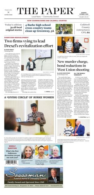
The shift to using the Freight Font Family instead of the dozen we had been using simplifies our design. What that means, though, is meeting the goal to make our stories easier on the eyes and easier to read. Freight brings both accountability and warmth, serious reporting and community storytelling, and a nod to tradition while bringing a touch of modernity. Freight is a superfamily, allowing multiple styles within the font to work together instead of creating visual noise.
Goal: Cleaner pages, smoother reading, fewer visual distractions.
You will see two colors used throughout both sections: Modern Teal and Heritage Blue. The names alone offer a glimpse of why they were selected to be part of 4.0.
The blue provides stability, trust, credibility, and seriousness. That’s why you see the color in infoboxes paired with stories and in the banner for Opinion.
Goal: Heritage Blue is darker, quieter, and more editorial than a bright corporate blue. Corporate, we are not. The color reinforces our accountability mission. Seeing that color signals, “This is solid. This is grounded. This matters.”
The teal softens the edges without weakening them. The color is organic without being rustic, has a freshness, and an air of creativity. I think of it like a necklace that sets off an outfit. The Culture & Community banner is Modern Teal, and you will also see the blue-green color in small callouts and accents throughout the sections.
Goal: To give readers the sense, “We are part of this place.”
I hope that as you go through these pages, you’ll notice our commitment to including more Burke voices and faces.
Our local contributors who pen personal columns are now under the appropriate heading “Burke Voices.” Our student columnist is featured on our Education Matters page under “Student Voices.”
Speaking of contributors, we also receive many news releases, photos, and stories from neighbors, business owners, and organization leaders. They now have a dedicated home on the Community Newsroom pages. Informing our readers about their work has a place right alongside our reporting.
Every week, we will have a “Weekly Question” on the front page, where three everyday residents will give their opinions. The “Burke Neighbor” on 2A spotlights the people who make the community special.
Goal: Bolster that foundational principle: Burke’s greatest asset is its people.
In addition to details, I also have an affinity for analogies. I think of The Paper like a culinary experience. Tastes range from savory and sweet to sour and salty. The best meals have a symphony of different flavors that play off and complement each other. That’s what I want for The Paper. Stories that reflect all aspects of Burke County. And 32 pages of content is definitely a meal.






















(0) comments
Welcome to the discussion.
Log In
Keep it Clean. Please avoid obscene, vulgar, lewd, racist or sexually-oriented language.
PLEASE TURN OFF YOUR CAPS LOCK.
Don't Threaten. Threats of harming another person will not be tolerated.
Be Truthful. Don't knowingly lie about anyone or anything.
Be Nice. No racism, sexism or any sort of -ism that is degrading to another person.
Be Proactive. Use the 'Report' link on each comment to let us know of abusive posts.
Share with Us. We'd love to hear eyewitness accounts, the history behind an article.