
New logo tanks; Old Timer prevails
-
Allen VanNoppen
Publisher

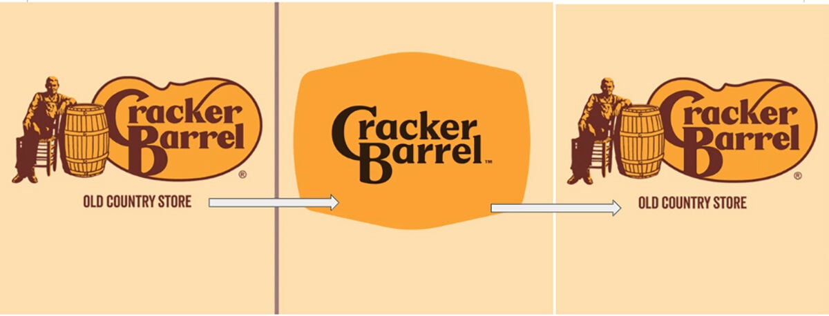
Unless you’ve been hiding under a barrel lately, you are keenly aware that Cracker Barrel recently unveiled its new, $700 million, uncalled-for, misappropriated, and disconnected logo that looked like it was cooked up by mad marketers in the research lab at IKEA.
It had zero connection to Old Fashioned Big Time Southern Breakfasts and household knick-knacks galore.
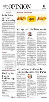
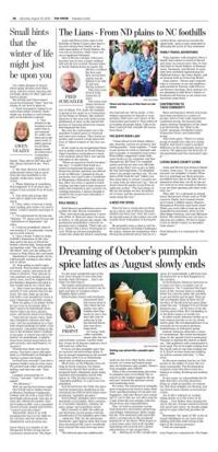
Gone was the warm sketch of Uncle Herschel perched in a rocking chair and leaning on his trusty barrel.
In its place was a tidy, minimalist wordmark straight out of Microsoft’s WordArt function. “Cracker Barrel,” it read.
No Uncle Herschel. And no wooden barrel! Nothing about Good Eatin’ and Country Shoppin’.
Anyone can tell you: Nothing says “Welcome to good country eatin’” like sans serif lettering that would befit a dental office door or a pharmaceutical brochure or both.
It’s not like business was licking the bottom of the barrel and the brand change was mandated by a board of directors.
Cracker Barrel’s stock has still gained 3.7% in 2025 through last week and has run up 34.1% over the past 12 months. In comparison, the S&P 500 index SPX has gained 14.4% over the past year, according to MarketWatch.
Everybody hated the new logo. It had no character. No connection. But plenty of room for misinterpretation.
The negativity crossed the aisle, as they say in Washington. Conservatives accused the company of going “woke.” The Democratic Party posted on X that it thinks the “Cracker Barrel rebrand sucks.”
Here’s the thing. Cracker Barrel was never about clean lines and sleek fonts. It was about biscuits as big as hubcaps, about hashbrown casseroles that could stun a bull, about fried breakfast specials designed by a cardiologist.
It had gift shops so cluttered that before reaching the register you’d trip over three snow globes, a jug of Maple Vanilla Bourbon Body Lotion, a stand-up Uncle Sam Blow Mold, and four ceramic roosters.
Along the way you’d teeter into the displays and knock to the floor several Liberty Bell Mini Salt Shakers, a couple of Squishmallow dolls, a bottle of J.R. Watkins Pain Relieving Liniment Spray, a clutch of Pecan Logs, some Wind Chimes, and sleeves of taffy.
And who could blame you for the teeter? You’d be off balance, too, after chowing down The Cracker Barrel’s Country Boy Breakfast.
Serving up a gazillion calories, this monstrosity includes “three farm fresh eggs, fried apples, hashbrown casserole and grits, Sirloin Steak, two pork chops or country ham with … all the fixin’s,” states the menu.
It’ll set you back $9.99 plus tax and a heart bypass procedure.
The criticism was so robust the wizbang execs at Cracker Barrel quickly threw it into reverse and announced they were trashing the new look and restoring the old.
Perhaps lessons learned from Coca-Cola (remember New Coke?), Pizza Hut (The Hut), and other corporate rebranding disasters that litter the consumer landscape?
Or maybe it was as simple as bean counters watching shares of the Lebanon, Tennessee-based company nosedive 12% after the new logo’s introduction on Aug. 8? That’s about $100 million. Gone quicker than Uncle Herschel’s peach clobber.
Cracker Barrel’s response? As close to an “Aww, shootfire, never mind” as you’ll get. The company ditched the idea and restored the old logo. Stock prices rose 7% in extended trading.
So, that’s settled then. Good. The old brand stays. Maybe (though doubtful) it was all a clandestine marketing ploy to drive media attention and build brand awareness. If so, it worked.
The company’s effort cost a reported $700 million. With that treasure chest you could buy 100 Super Bowl ads and still have $600 million left over. You could blanket every major city in America with your brand on prime billboards (think Times Square) for years.
With that bankroll, The Paper could launch sister editions in Caldwell, McDowell, Rutherford and Catawba counties and give away its paper free; own all Google keywords; build a state-of-the-art headquarters and media campus with podcasting studios, training centers and event space; fund for centuries The Paper Festival, a signature downtown event drawing tens of thousands for music, with 25 food trucks selling Cracker Barrel Heartattack Breakfasts. Fried up and served on a stick, of course.
(SIDE NOTE TO CRACKER BARREL DIRECTORS: You can get a tax deduction on that $700 mil by donating it to the Western North Carolina Journalism Foundation. You’d be saving local news nationally.)
Back to the story, as it were.
I reached out to a college buddy who leads the American Restaurant Marketing Association, Robert Jenkins, and asked him what he thought about the new logo.
“Here’s the truth,” he said during a phone call from his office in the back of a restaurant kitchen, judging from the discombobulated commotion that sounded like a knife fight in a bowling alley. “Logos matter less than old-fashioned biscuits. When you tinker with nostalgia, you tinker — HEY! Johnson! Clean that crap off the floor before someone steps in it damnit! — you tinker with America’s stomach. That’s dangerous territory. After all, this is the same nation that nearly rioted when Taco Bell changed its nacho cheese formula.”
All for naught. It’s back to the future. “We said we would listen, and we have,” the chain said in a Facebook post. “Our new logo is going away and our ‘Old Timer’ will remain.”
Allen VanNoppen is the publisher. He may be reached at 828-445-8595 or allen@thepaper.media.